


5 Foolproof Steps: Creating Product Label Designs That Sell
How can you be sure that you’re doing the best that you can to sell your products?
While the e-commerce has made available freer, less costly means of hosting, promoting, and selling products, it is many an entrepreneur’s dream to be among brands on the shelves of physical shops, big or small. Competition is tough. You know this.
Consider the playing field: The average family uses some 150 products. Supermarkets today carry close to 47,000 products. The internet is an ever bigger marketplace. Are you someone who stands out?
With competition vying for the limelight, it makes it a huge challenge to get your audience’s attention, and even harder to convert shoppers. With new products coming in every year, a remarkable label makes all the difference between closing a sale, and losing that sale to a nearby competitor.
Get noticed! Learn the difference between a good product label and a bad product label, and how you can change your own labels to market your products effectively. Below are our 5 foolproof steps to creating a product label design that sells.
Step 1:
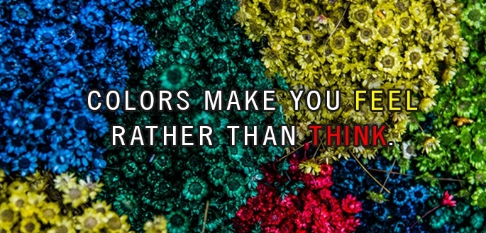
Choose your color palette carefully.
Color communicates quicker than shapes or words ever will, because they work directly on our feelings. This is a powerful, first-look tool that works on your prospective customers to transform your labels (and products!) into what we call, “shopper stoppers”.
MAKE YOUR BRAND COLORS OFFICIAL
Ever wonder why McDonald’s uses its famous yellow arches? This is because yellow is the color most visible in daylight. What are your brand colors? Why have you chosen them? Are they consistent?
Your brand colors instantly evoke feelings and subconsciously set the mood—we cannot stress how strong this element is. This is why, when set on your brand colors, they should be used consistently throughout all your communications— your website (in RGB color space, for screen viewing) and printed collaterals such as brochures and flyers (in CMYK color space, for printed colors). Your product label should use the same colors. Consistency means repeat customers will know who you are without having to read anything, and without needing to look at competition.
USE COLOR TO ORGANIZE YOUR PRODUCT LINE
Differentiate your flavor variants with color. Again, this helps your customers quickly shop for the sub-brand they are looking for. Use color that most accurately conveys the flavor, scent, even target market of your product—green is associated with trees and nature in general, blue with water, pastel colors for baby products, a certain purple for freesia flowers, and so on.
Step 2:
If you can, use images and symbols with text.
You’ve heard the saying, “A picture is worth a thousand words.” Like colors, images and symbols can communicate faster than simple text.


CREATE A GOOD BALANCE WITH TEXT
Your take on an image might not necessarily match your customer’s. To avoid confusion and too much ambiguity, supplement text with images, and not the other way around.
Step 3:
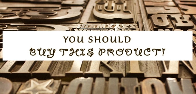
Test fonts and decide on the most readable and visually-pleasing to match your brand personality.
While the two elements above are principally important, text is essential in conveying your message precisely. In this step, it is important to decide on a font that enhances the look of your product labels, making them more conspicuous and marked in the eyes of your audience.
YOUR FONT ADDS TO YOUR UNIQUE IDENTITY
If you’re overwhelmed with choices, eliminate identical fonts and select at the most 10 fonts to pick from. Remember that the style conveys personality—cursive is usually delicate and a bit harder to read, bold fonts are oftentimes seen as commanding and are seen as the “shouting” text voice.
Once you’ve tried using the fonts on your label design (Tip: Others in the shortlist could work as your subhead and body text, as long as they jive with the main font you choose) decide on the right font to match your personality. Get a 2nd and 3rd opinion if you’re having a hard time finalising the fonts.
LESS IS MORE, SIMPLE IS BETTER
The quicker you convey your message, the easier it is for your customers to identify you on the shelves. Avoid decorative fonts that render text unreadable and stick to styled fonts that are still legible from shelf-to-eye distance. Too small and too tight is also a no-no. Never make your customers go through the trouble of squinting just to be able to read what’s on your label.
Too many fonts used on your product labels will also make your layout look cluttered and may fight with you on your goal of making easy-to-read and striking label designs. The wrong font can kill sales, literally.
Step 4:
Test label sizes to see what is best for your containers.
At Inkable Label Co., we’ve made it a point to offer made-to-measure labels at no extra cost. This is because we believe the size of your labels should match perfectly with what your concept and container calls for. How your container looks like and what size it is is a big consideration in the final look of the finished piece.

SCALE IS IMPORTANT, BUT CONSIDER YOUR CONTAINER.
A large plastic bottle with a medium-sized label, owing to the size of the container, will probably go unnoticed. But this same label size could then be optimal for a standard squeeze bottle. Simply put, your labels should be tailor-made to your containers for your products to stand out as professional and put together. Otherwise your products will easily look lousy on shelves and in your e-commerce shop.
Step 5:
Don’t forget to include important information!
While this may seem like something that is already part of your label design’s SOP, many people forget to include all pertinent information on their label designs. This is especially important in continuing the relationship your customer started with you from the moment they purchase your products.

It is also of note that this step also helps validate your product in the eyes of your prospects and may be the factor that decides whether they buy your products or not. Apart from the usual text and information, include specific details that your market would look for when deciding the product is right for them.
MAKE IT EASY FOR CUSTOMERS TO CONTACT YOU
A Center for Retail Management (Northwestern University) retail study reports that loyal customers represent 55% – 70% of total sales. If you want your labels to work hard for you, make it easy for your customers to find you.
By making sure to place your website, mailing address, contact numbers, email, as well social media accounts on your labels you make it easier for customers to interact with you. These details take up little space, yet provides big value. This simple addition on your labels nourishes your relationship with prospective loyal customers, continuing conversation through feedback and an outlet for learning more about your products. Feedback is fodder for smart brand decisions and innovations. Inviting customers to become followers online is the first step to driving them to your online marketing.
BONUS TIP: Review and look for mandatory information you might have missed.
The primary value of your labels should lie in its branding and marketing efforts. However, keep in mind that labels should first and foremost also help assist your customer in making the right purchasing decisions. This also extends to your mission of providing honest, straightforward literature that reassures your customer that your product is indeed right for them.
By law (depending on what your product is), certain information—warnings, contradictions, certifications, and so on—must be printed on your labels. Place required information on the back of the label to face the shelf—reserve the front for visuals and text that will sell and identify your product. However, if you feel that a certification also has marketing value (for example, if your target market is largely vegan and is committed to a certain lifestyle) then include the badges and seals on the front, small enough to not interfere with the layout but large enough to be readable. Need guidelines? Search posts here for help.
Your label is your “last stand” and final opportunity. If your labels are incompetent, you lose the opportunity to get the sale. And the sale after that. And then multiply that by a hundred. You get what we mean.
These 5 foolproof steps will guide you in making the correct decisions in creating product labels that are not only eye-catching but also extremely effective, for a well-developed marketing tool that will convert more shoppers, for more sales and a strong presence in-store.
Do you have any tips for great label design? Share it with us in the comments below!


