Best Hot Sauce Label Designs
A big inky splat to you!
Hot off the press are zesty label designs that we can’t wait to share with you. If you’re looking for big inspiration, these spicy hot sauce labels will definitely get your light bulbs firing!
If you’re still at the stage where finding inspiration for your own label designs isn’t coming by too easily, you’re not alone. Don’t beat yourself up; many designers and small business owners have gone from Study A to Study Z before achieving that perfect label design.
In the meantime, get inspired and take a look at our best hot sauce label designs list, for remarkable labels that are both relevant and eye-catching!
Inkable Label Co.’s
Best Hot Sauce Label Designs List
1.) BENNY Ts VESTA DRY HOT SAUCE
THE ORIGINAL DRY HOT SAUCE
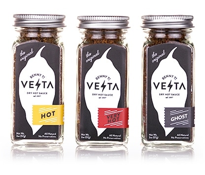
Formerly Vesta Fiery Gourmet Toppings, Benny Ts Vesta is Ben Tuorto’s brainchild. Ben, an avid chili and spicy food enthusiast in Raleigh, NC, wanted to offer something new and exciting for those with a penchant for everything tasty and spicy. Seeing the need for heat and flavor that can be added to elevate any food or beverage, Vesta was established. Fans even go as far as sprinkling this on ice cream and swear by the “Very Hot” version, taking this small and portable shaker with them while travelling, without needing to add any liquid to obtain the spiciness they require.
*Art direction and design by Paul Tuorto
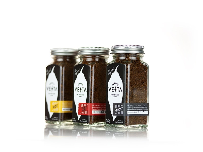
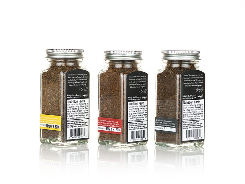
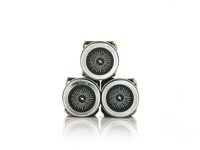
Vesta is original in that it is the first and only dry hot sauce in the market. The concept was fleshed out with the belief that heat should enhance and not disguise any food or beverage’s flavor. All varieties are made with the freshest North Carolina chile peppers, and everything is done manually—chopping, processing, mixing, and packaging—to ensure top-quality products. They’re also certified as a Goodness Grows brand in NC, vegan, and don’t use any preservatives.
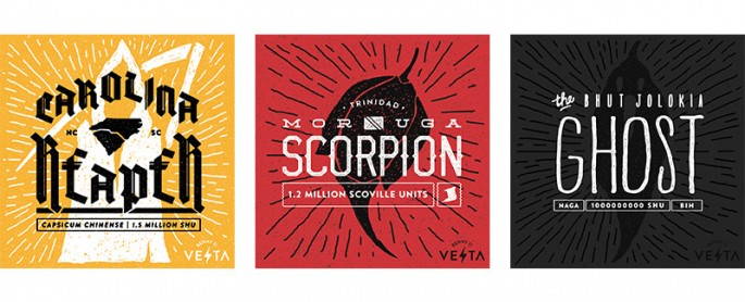
Benny Ts Vesta Hot variety is a lovely introduction to heat, with mild to medium hot chilies like Jalapeño, Serrano, and Thai. The more “advanced spicy food fan” will enjoy their Very Hot variety made with hotter chilies such as Habanero, Scotch Bonnet, and Devil’s Tongue. And for those who like it scorching, the Ghost Vesta variety does not disappoint with the fiery mix of Habanero, Moruga Scorpion, Carolina Reaper, and Bhut Jolokia/Ghost chilies. Running for a limited time only, Vesta has even gone as high as 1.2 Million Scoville Units, with their new Moruga addition that boasts of the perfect balance between fruity Habanero and the dizzying heat of Trinidad Scorpions. Benny Ts knows how to do it—up until last year, their own specialty chiles (Bhut Jolokia, Moruga, Reaper, et al) were exclusively used for their products which have been cultivated on their own Vesta Farm.
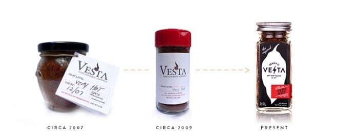
In 2007, the company went on to package their dry hot sauces in honey pot jars with leaflets. Since then they have gone through two revisions, ending up with a sharp looking label with a more convenient dispensing shaker system that is both more efficient and way cooler. We think it’s also smart that the evolution of Vesta’s packaging + label design was dictated by research, product sourcing, and most importantly, community feedback. Just a simple shake, and the Vesta experience begins.
TIPS:
- We do subscribe to the adage, “If it aint broke, don’t fix it.” However, as this example perfectly illustrates, sometimes focusing not just on formula development but rather on packaging and label design can make a huge difference. Your customers essentially pay for what’s in the package, but it doesn’t hurt to improve the look and feel of your containers if the need for change shows up in your customer insights docket.
- For more frequent handling, especially if your product is meant to be a companion on the road, use a laminate over your label prints. Chiefly with gloss laminate (a reflective coating, as opposed to matte laminate with gives a satin finish), this added layer provides some protection from ink scuffing, helping preserve your labels for longer.
2.) Apinya Thai Food Co.
WORLD INSPIRED. THAI INFUSED.
From Northern Virginia comes a hot sauce brand that is full of character. Created and owned by husband and wife team Adam and Apinya Ross, Apinya Thai Food Co. combines Thai ingredients with flavors from various world cuisines. Vegan, low sodium, fat-free and gluten free, all their sauces are built with fruits and vegetables as the base, unlike the usual vinegar-based hot sauces.
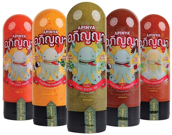
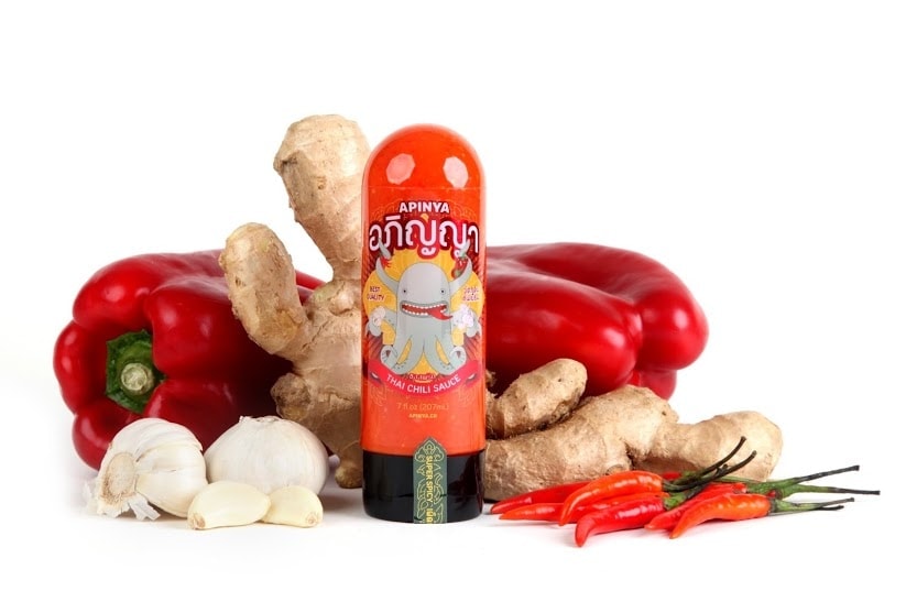
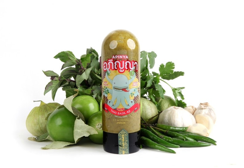
Harmonized with seafood, chicken, veggies, or meat, Apinya Thai Food Co.’s sauces are paired with food based on the taste profiles of each unique blend. Their sauces are modern twists on Thai traditions: Pumpkin Panang, Andaman (a premium sauce inspired by “nam jim thale”), Thai Basil Aji (innovatory of the Peruvian Aji Verde salsa), Coconut Harissa, Ghost Vindaloo (with Bhut Jolokia chilies, one of the hottest varieties in the world), the duo’s original Thai Chili Sauce, and the newly-launched Naga (titular fireballs that arise from the Mekong River said to be from an ancient serpent) that we’d love to try just because it also comes with an awesome gold sticker. Taste and aesthetics, check.
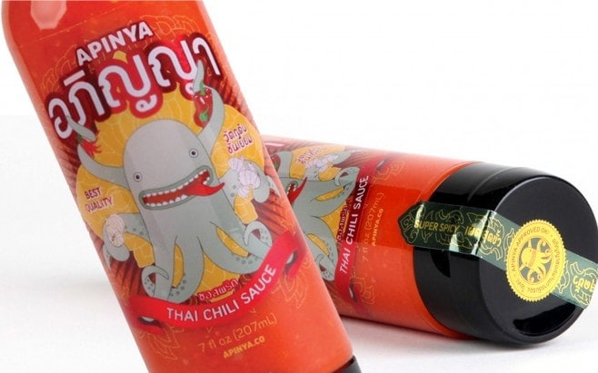
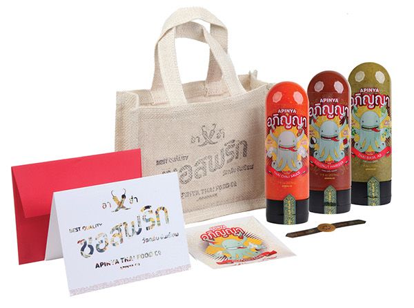
Aspara created the brand identity, packaging, and label designs. The brand’s strong Thai roots flourish in the vibrant colors, artwork, and Thai script on all collaterals. The official mascot, an illustrated octopus, was designed around the significance of this ingredient in world cuisines, as well as its capacity to transform into an unforgettable and marked brand ambassador to match Apinya Thai Food Co.’s brand personality.
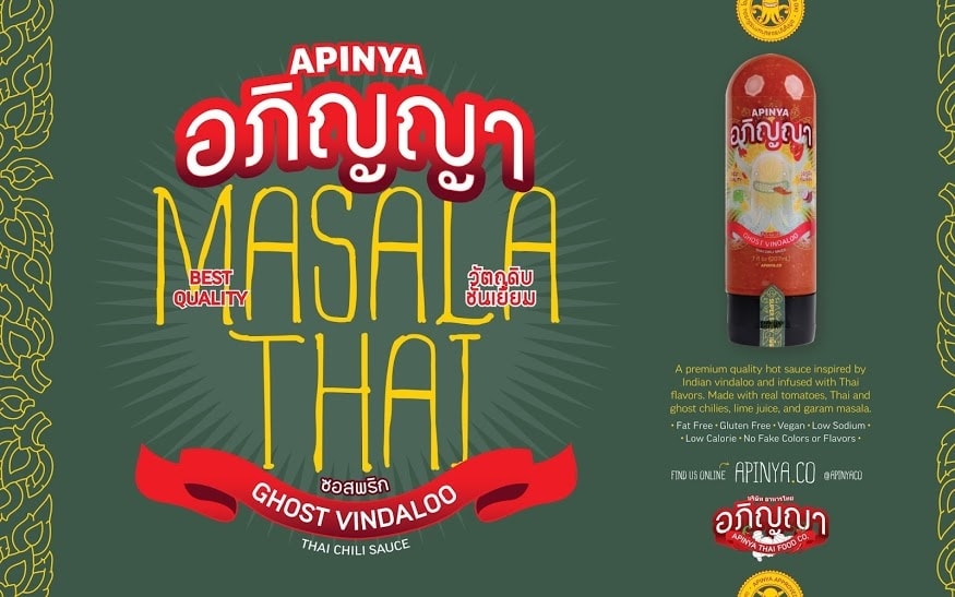
The authentic and fun brand experience is taken to another level: quick Thai references are available for enthusiasts, and even free wallpapers and a printable papercraft of the playful octopus are free to download as one further explores their website.
TIPS:
- Don’t shy away from injecting personality into your brand. Labels are a means of identification, but more so a vehicle to make your products remarkable. But fun concepts are not for everyone—make sure to align your packaging and label artwork with your brand identity to make sure these are consistent and represent your brand personality and values well.
- Logos are your unique fingerprint that ties everything together. While most logos utilize stylized text, fonts, and shapes, creating a charismatic mascot can extend your franchise and take up a life of its own, all at once making your brand more memorable and personable to customers.
- Clear labels give you that “no label look” which work in synergy with transparent containers, especially if the contents are of visually-stimulating colors. Sketch concepts (or ask help from a design professional if able) to see if your label concept, artwork, and color scheme works with your chosen containers.
3.) MINA HARISSA (CASABLANCA FOODS)
TRANSFORM YOUR MEAL INTO A CULINARY JOURNEY
Casablanca Foods’ flagship product, harissa, is a sublime blend of Moroccan cuisine’s culinary culture. Harissa is spread, dipped, or simply drizzled on any meal, and is enjoyed particularly with grilled meats. Figuring largely in kitchens from Marrakesh to Casablanca, harissa is a chili-based key condiment that is the sriracha of North Africa. However, the Mina Harissa sauce is unlike the typical harissa. Created by Mina Kallamni and son Fouad Kallamni, and distributed under their own company based in New York, Mina Harissa is a versatile, transformative red pepper sauce that can reshape a simple meal into a savory delight.
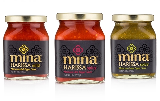
The usual harissa is a ruddy red-orange, while Mina Harissa is a striking magenta (Note: they’ve recently replaced the medium variant with spicy green). This premium Moroccan hot sauce recipe is a composite of six all-natural ingredients—red pepper, extra virgin olive oil, bell pepper, garlic, a bit of vinegar, and a dash of salt—perfected over time, for a truly versatile condiment. Heat comes in three flavors: classic, mild, and green. This reinvention of harissa is successfully achieved, its heraldry determined by the founders’ distinct creativity, taste, and style. Its roots are authentic and this is evident in their packaging.
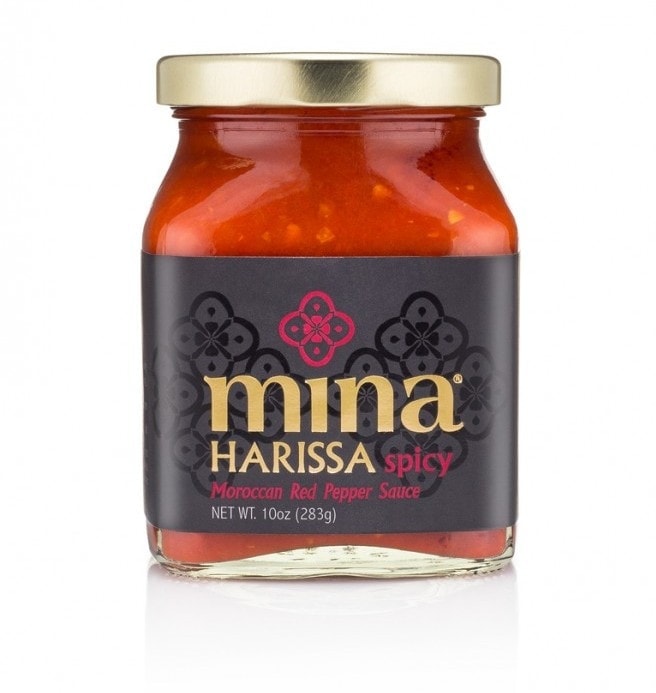
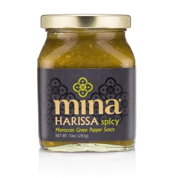
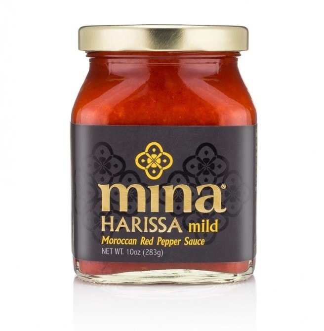
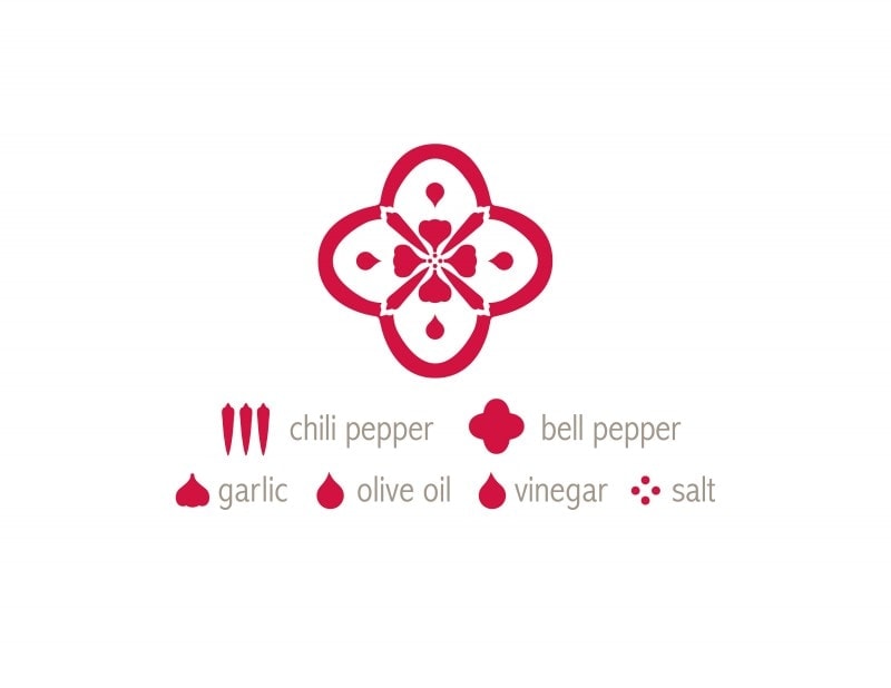
The branding for Mina Harissa’s focal point was created using the six ingredients of the sauce. This was completed by the unification of all ingredients, contained in the floral outer shape of a cross-sectioned bell pepper. Four chili peppers form the cross, adjoined by each clove of garlic, and the central dot quads represent salt, concluding with four droplet shapes inside each curve defined as oil and vinegar. By using shape outlines, their logotype-pattern was created; and in a related manner, this is not unlike the ornamental figures found on native Moroccan tiles and cloth. Inspired by Arabic letter forms, a stylized rendition of this brand identity is augmented by a elegant color palette of black and gold. Variants are marked by different colors to designate heat levels and kind of peppers.
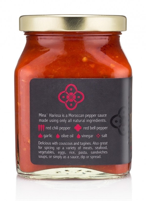
We think the finished packaging with the wraparound label set against the vibrant sauce color looks stately and the black background offsets the sauce and makes it look more appetizing. The gold metallic lid gives prominence to the same gold on the logo name on the label. The result is a polished and sophisticated brand identity and product presentation contrary to the usual harissa in yellow tins and tubes.
TIPS:
- Printing labels doesn’t end at artwork design. There are many finishing options that can elevate your product labels for a more conspicuous “dress”.
* If you are going for higher contrast, use Gloss laminate as this reflects light and produces more commercial results. Matte and Satin will give you more subdued prints; however with this finish you have the choice to do beautiful Spot UV or spot varnish, which are selective areas of high gloss (as seen on the background pattern in this example).
- When creating your graphic element, take into account what your brand stands for. Your logo can depict anything relevant related to your brand, from the tangible (representation of your product and its ingredients) to intangible (freshness, passion, love, safety, and so on). People will associate your name and their experience with your product to your logo, so do not take this task lightly.
- If you’d like gold foil but don’t have the budget to do costly foil stamping, a cheaper alternative that works is to print on silver or gold foil labels and keep the areas that you want to appear shiny unprinted.
4.) ZUKALI
MEXICAN GOURMET
The different taste nuances of Mexican gastronomy, where flavor is foremost, is made manifest in Zukali, a brand that offers handcrafted gourmet products inspired by its Mexican heritage. Owner Cesar started producing commercially from small beginnings. Big taste fueled by passion for creating salsas for cookouts with family and friends led to Zukali’s first product: Fire-roasted jalapeños. Continuous innovation meant the development of other salsas that incorporate various kinds of peppers used in unique recipes. Their Pasaporte Variety Pack features flavor profiles from Peru, Brazil, and Argentina.
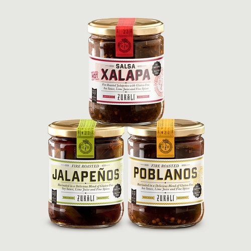
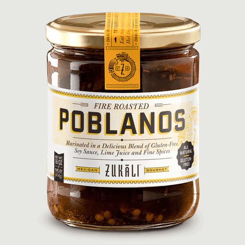
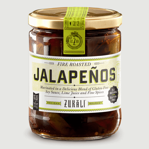
The company’s choice food toppings are authentic, original, and are finished as small-batch products using chilies indigenous to their identity—jalapeño peppers (also huachinango, medium-sized peppers popularly known as Texas’ state pepper) and poblano peppers (also ancho or chile ancho in their dried state which are large mild chili peppers from Puebla, Mexico). Both are eponymous to each of Zukali’s bottled offerings and are to be enjoyed more as food toppings rather than hot sauces.
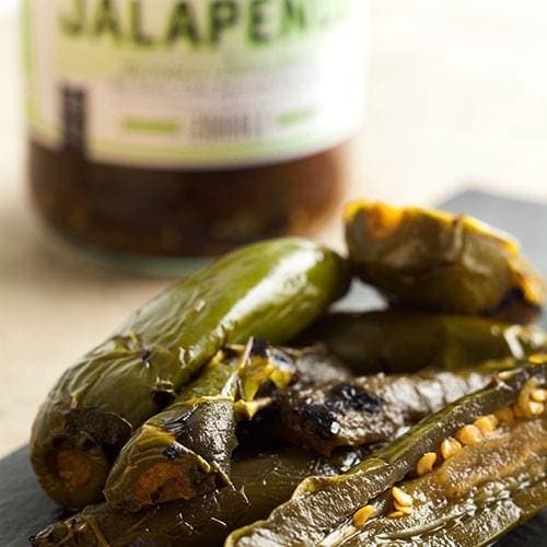
Zukali’s Fire Roasted Jalapeños and Poblanos are pickled in a distinctive blend of gluten-free soy sauce, lime juice, and their secret recipe of fine spices. Each pepper is carefully roasted to perfection by hand over an open fire, bringing out characteristic rustic flavors and spice notes.
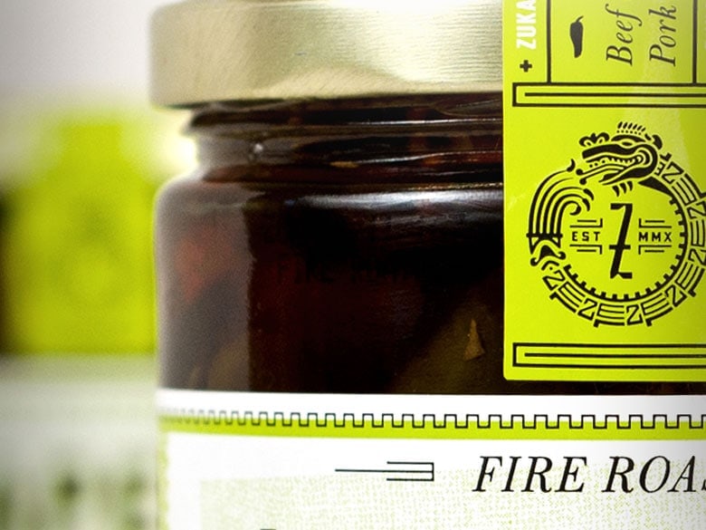
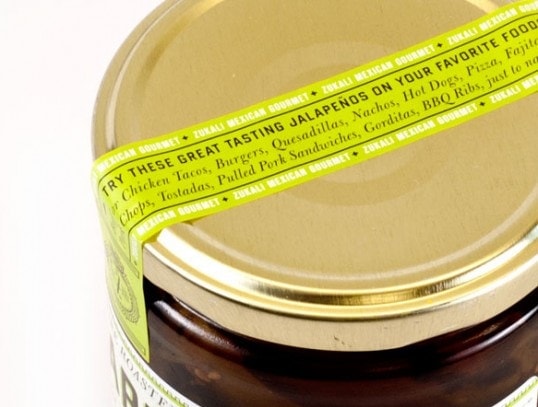
Imaginaria Creative, a design studio based in Texas, was commissioned to develop the identity for Zukali. They chose the prominent figure of the Aztec serpent God Quetzalcoatl (depicted in the form of an ouroboros, which means “tail swallower” and symbolizes eternal life and protection, and also change and evolving) as the inspiration for the brand’s logo, intensifying its appeal as an iconography relating to Mexican culture and history. The rich colors and alternating stocky-graceful typefaces set on fringed label artwork are used cleverly to project a more modern sophistication rather than the typical Mexican aesthetic.
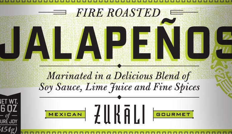
We love the addition of the logo as a graphic element on the background, almost like a watermark, in that the branding is there but it gives way to focus on the name and variant of the product. Zukali’s labels are sleek, cool, and compact—enough to have a good part of the clear bottle showing, and the exquisite peppers and salsas inside it.
TIPS:
- The more in tune your label designs are with your brand identity, the more people will associate your brand with uniqueness and authenticity. If your product differentiation leverages on tradition and culture, use this to your advantage by creating labels that identify with who you are, instead of going for the usual modernistic approach that can become generic when set beside other similarly-themed label designs.
- Make a label that accommodates your text comfortably and fits your packaging well. There is no standard label size or label placement—design around your concept and, if you want to feature the contents of your packaging (in this case, the texture of whole peppers and its seeds, as opposed to a solid-color mixture), make labels that don’t cover the entire bottle. Sometimes less is more.
5.) ADOBOLOCO
HAWAIIAN HOT SAUCE COMPANY
What started as a homeschooling garden project in Maui is now a full-fledged, family-run business of “Hawaiian Handcrafted Hot Sauces”. The Parsons family, after a bountiful pepper harvest from their project, decided to churn out their own chili sauce, not wanting them to go to waste. Those educational jalapenos (version 1 of the sauce originally packed in an old shoyu bottle, enjoyed by only family and friends) are now the core ingredients of every Adoboloco recipe. Run solely (and impressively so!) by all members of the family, Adoboloco now partners with small local farms to source fresh ingredients for their delicious sauces. They are advocates of Permaculture, with in-depth videos and logs of how they grow all their different chili varieties from seed in their organic micro farm.
Each recipe is built upon four ingredients (except for Pineapple Habañero, which has locally grown pineapple), with hot peppers from the local farmers they work with. Their hot-sauce recipes are meant to highlight natural flavor profiles of individual peppers, rather than masking the flavor of the food they are to be enjoyed with. With trademark flavors such as popular pure Ghost pepper sauce Kolohe (Hawaiian for mischievous), Hamajang (in Pidgin English this means “messed up”), and Bangkok (named after one of their handsome roosters), Adoboloco has gone from delighting their family and friends to satisfying customers all over the world with their products. Their Recipe Blog has a wealth of tasty treats, including the famous Filipino Adobo recipe, which inspired their brand name.
The lines of the Adoboloco logotype are clean and dynamic. The beloved rooster figures largely in Adoboloco’s packaging and labels, and each bottle stands out with its bold artwork. The wraparound label format is utilized to the fullest as the real estate is maximized by label artwork that is set up like a cool series of smaller infographics. These illustrate all descriptions that are commonly seen as simple text, making the discovery of information more interesting.
The use of Hawaiian slang contributes largely to the appeal and uniqueness of their brand identity—this explicitly (and proudly!) shows that the product is made in Hawaii. We think the handwritten detail adds considerable value in the eyes of their customers, as this translates to the same care and patience put into everything that the owners do to ensure freshness and consistency of each Adoboloco sauce.
TIPS:
- If you have the means to do so, add something to extend your brand experience. Remember that each time someone purchases your products there is always that important opportunity to connect with them and build a lasting relationship.
* In this example, the use of the QR code for quick feedback helps Adoboloco’s customers interact with them conveniently, at any time and any place. Don’t contain call to actions on just your website when you can also add this (and the means to do this) on something your customer already has in their hands.
- Most often, designing label artwork can be an overwhelming task. If you need to use the whole wraparound space for product information and want to make this more creative, make a content outline first. Because this can quickly go from simple to cluttered, mockup sketches on paper rather than on screen can help you determine where it gets too busy. This especially saves time if you aren’t too adept at handling graphics programs. You can always hire someone to finalize everything when you’re set and ready.
- Think your label design is on the unkempt side? Before trashing that design (and if you’re amenable) why not try to “version” your label artwork from full-color into single color? This certainly wont work on every case, but simplifying one aspect (color variable) might just be the answer to your problem.
6.) BRAVADO SPICE CO.
BIG. BOLD. BRAVADO.
Houston-based Bravado Spice Co.’s mission is to craft bold and delicious hot sauces using creative recipes and flavor combinations. Entrepreneurs James Nelson and Jeremiah Tallerine have succeeded in satisfying (and impressing) new customers and hot sauce enthusiasts alike, with their sauces even winning awards in various contests. Focusing on raw flavor instead of just heat, Bravado Spice Co.’s products are built with fresh and novel combinations ranging from green apples to strawberries, sweet pineapples to tart blueberries. Every 5 oz. bottle contains all-natural ingredients, with no artificial preservatives.
While nutritional analysis is part of the development of each product, Bravado Spice Co. stresses that flavor is certainly of top priority. Their popular line-up consists of four Texas-inspired flavors: Jalapeño & Green Apple Hot Sauce, a mild savory combination of jalapeño peppers and granny smith apples (note: perfect for breakfast tacos and grilled chicken); Pineapple & Habanero Hot Sauce, a moderately spicy and sweet combo of fiery habanero peppers and sweet pineapples (note: best with seafood, grilled pork, and cocktails); Ghost Pepper & Blueberry Hot Sauce, an intense blend of scorching ghost peppers and tart blueberries (note: enjoy with smoked meats and grilled beef); the all-new Crimson Hot Sauce, an aromatic garlic hot sauce with medium heat from the marriage of arbol chilies and red jalapeños (note: best with wings, pho, tacos, pizza and fried chicken).

The brand labels feature a thin, solid header bar, each with a printed color that is nearest to the hue of the sauce it names. Resting against the charcoal-textured background, the logo and flavor name stands out proudly. For us, the effect is like looking up at a chalkboard menu, knowing that what you’re looking at is your favorite thing to order. It’s stark and straightforward, and very approachable.
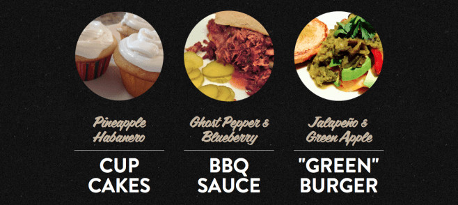
Recipes by the company using the sauces are shared on the site. We think these are awesome—they not only make us see the sauces as truly versatile and different from the rest; they also simply want to make us go out and buy more sauce so we can cook/bake to satisfy our curiosity about the mouthwatering food shots. How would Pineapple & Habanero cupcakes (a.k.a. Crunk-Cakes) taste like?
TIPS:
- Clear bottles mean color of contents will show through. If you’re designing for labels against a vividly-colored background, consider how the colors on your artwork would look like once they are on your containers. Think about synergy. No matter how great you think your label artwork is, if they don’t work to complement and enhance the overall look, then you aren’t maximizing the impact they could have on your website, and on the shelves.
- While the traditional “real estate” for directions for use would be placed at the back part of the wraparound label (sometimes almost as if fine print) consider placing most important directions on the front. This helps your customers easily see how to properly use and store your products. In this example, “Don’t fight it, shake it” and “Refrigerate after opening” are both front and center of the bottle—people won’t miss it and, since naturally we’ll be looking for the name of the product when reaching for it, always a high chance of this reminder being read.
- More experienced graphic designers can dish out complex color combinations and concepts for different label finishes, such as Spot UV on matte laminate. When in doubt, simple is better. Feel free to experiment; but for readability’s sake, choose light colors for text on dark backgrounds and vice versa to ensure that your labels have good contrast and are easy on the eyes.
7.) BANDAR MONKEY FOODS
INDIAN FLAVORS. AMERICAN TASTE.
(bun-dar) (Hindi)
– noun, monkey
– noun, mischievous man or boy
Fun-loving founders Lalit Kalani and Dan Garblik came up with the brilliant idea of creating the first mainstream Indian hot sauce line as part of Bandar Monkey Foods repertoire, inspired by the most popular and piquant flavors in South Asian cuisine. Two delicious sauces, Spicy Mango Chili Sauce and Mint-Cilantro Chili Sauce, are their version of reimagined classic Indian chutneys that perfectly represent the American and Indian cross-cultural collaboration between the two minds behind the brand. Meant to be enjoyed on just about anything that warrants an exotic kick, Bandar Monkey Foods’ chili sauces are chunky condiments that can be paired with sandwiches, falafels, kebobs, tacos, hot dogs, even instant ramen noodles.
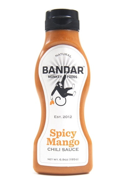
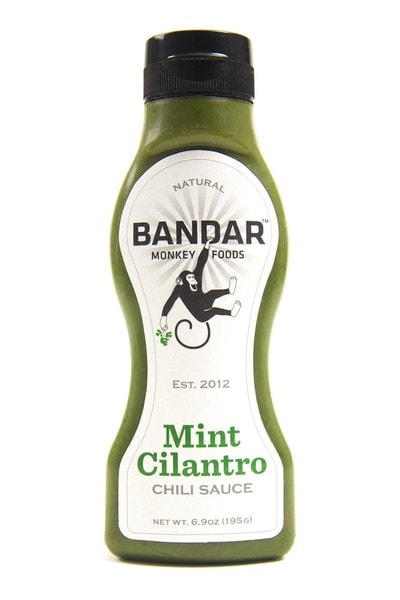
The transformation from traditional to mainstream finds both hot sauce variants as easier to eat, with their trademark spicy pureed versions winning in the Wharton Business School’s innovation tournament and eventually leading to the creation of the business. The squeeze bottle container makes indulging in the sauce more convenient without needing to use a serving spoon. And zeroing in on their American target market, this format was something everyone already knew how to use—much like the ubiquitous ketchup. Made more personable, the brand image meant that it was to depart from the fascinating yet intimidating Indian way of preparing food (something that was more exclusive of foreigners save for learned chefs, which meant the sauces would probably be used only with specific dishes, such as tikka masala), making the sauces more yielding to a broader market, and positioning them closer to mayonnaise and mustard.
To augment this new product placement, recipes are also available on the site. They aren’t complicated or formidable; rather they are delightful plays on the marriage of simple Indian-American dishes that anyone can make. Each sauce comes with its own stock of culinary fun that accredits the regular person to try something new—Mint-Cilantro Chili Sauce recipes such as Bandar Kale Salad with Mango, Salmon, and Avocado; Spicy Mango Chili Sauce recipes such as Spicy “Monkey” Wings are mouthwatering and seriously easy to prepare.
TIPS:
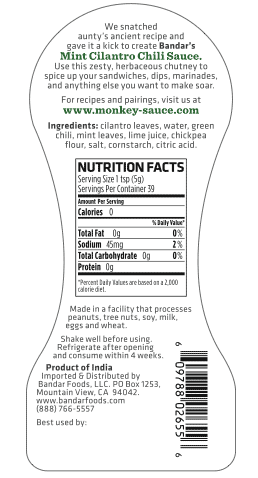
- Bandar Monkay Food’s labels are a great example of custom labels. Why not make your labels fit perfectly on your containers for a more tailored look? This adds value by making your final packaged product look more professional. By using a diecut, you can mold your labels to grooves and around tight corners. Diecuts are cookie cutter molds that make it possible for you to get custom shapes and sizes, for seamless and faultless labels.
- If you are using squeezable containers, remember that this will certainly mean that your labels will also need to be able to withstand the stress of repeated compression and decompression. Use the appropriate label stock for your purposes. Need this to be oil-proof and waterproof? Choose plastic film (BOPP) over paper—the cost would be a bit higher, but your brand will thank you for it. A more flexible option would be to go for shrink wrap sleeves to ensure your labels stay pretty for as long as they are used.
8.) GET HOT SAUCED

Last, but certainly not the least, is a company that has come up with the remarkable idea of celebrating hot sauce by having their customers enjoy the process of making their own spicy concoctions at their own convenience, equipped with the essential ingredients and containers. The “Hot Sauced Guys” are connoisseurs of everything saucy, spicy, and sexy. They bring to the table a different concept; understanding that sometimes, in the debate of which hot sauce is the best, most often it is the one that you yourself make. This savvy design is based on the owners’ scrumptious and memorable experiences of food with family and friends, and inherent in this is “a love for creating, a need to share our spicy interests with others”.
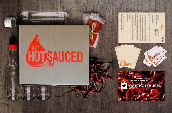
Established in 2014, Get Hot Sauced started operations after they had perfected their recipes. The goal was to craft the finest hot sauces their side of Mississippi. Once they were ready, they put together the necessities crucial in forming blueprints of many customers’ versions of savory hot sauces and packaged these as a DIY kit, naming their flagship products the Make Your Own Hot Sauce Kit, (original, extra hot, and mild variants). Each box is pretty comprehensive as a hot sauce DIY kit goes: Arbol, Habanero, New Mexico chili peppers, “super secret spices”, 3 bottles (for bottling your own flavors), warning labels, customizable labels, “military grade hand protection”, simple instructions, and “unexpected surprises”. It’s full of personality, and we think their customers spend hours of hot sauce creative fun with these babies.
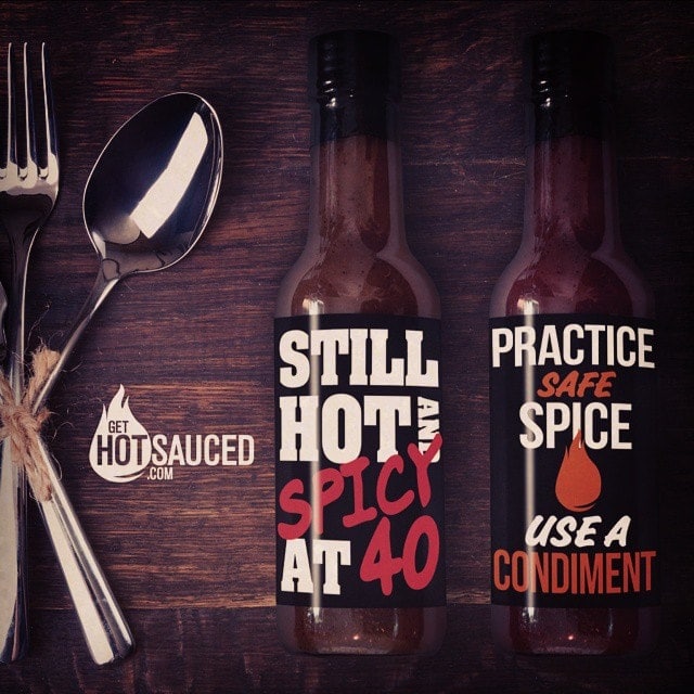
Get Hot Sauced also participates in monthly hot sauce clubs, have their own label production service, and design agency, Figsburry Creative Group, for people who need more polished labels for gifting their custom condiments. There’s also a Spicy Recipe Blog that encourages people to share in the same creative journey of inventing spicy food and drink treasures using their products. For those looking to get a quick fix, there is also the option to purchase the Get Hot Sauced collection of six private label sauces and snacks. We especially like Lucifer’s Liquid Diet (Ass Kickin’ Margarita Mix – with glasses!, Dave’s Chile Salt, Dave’s Original Mary Mix) and Get Hot Sauced’s Sexy Habanero Garlic Sauce (their signature Garlic Hot Sauce), whose labels they’ve also designed.

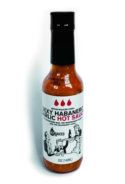
We’re huge fans discovering through creating and experimenting, which is why we love this concept. Andrew, co-owner and creative director, says their label design process is never not part of the hot sauce-picking process—this holistic way of looking at things only ensures that there is no disconnect between product and presentation. We think their branding is very likeable and approachable (yes, we picked up on the hidden message in the logo), and their treatment of private versus collective labels is truly professional. Consistency is key, and their designs always mix in a bit of humor to keep the conversation flowing.
TIPS:
- When designing labels with a full-color graphic, with a poster/mini billboard-type layout, consider using solid white, opaque labels to maximize the space. Alternatively, when using clear bottles and you’d like to make some of the background (contents) show through, choose clear labels and “wash” the areas underneath with white ink so that your printed areas stay opaque, for an interesting effect.
- In this example, Get Hot Sauced illustrates that clean and simple works if branding is consistent. Especially for products that give the “last touch” to customers, we recommend using matte laminate for increased writability with pens and markers. Gloss laminate can also be used for sharper, brighter-looking prints on labels; however keep in mind that only permanent markers would be able to solidly leave clean impressions.
—
Labels carry the heart and soul of your brand, and we don’t take this huge responsibility lightly. We’re always excited to discuss branding, Prepress, and then sanding down to all the fine points until we’re absolutely happy with the end result. We hope you enjoyed this post, and stay tuned for more awesome label designs!
*Just a note that we believe that branding isn’t everything: what makes your labels work in the long run is the dedication you put into your products and services, from defining your brand values, to your company culture, to speaking about things that you care about through your brand’s voice.


