Best Beer Label Designs

A big inky splat to you!
Hot off the press is a pack of refreshing label designs that pours smooth, starts crisp, and then tapers off to a nice creative buzz. If you’re looking for big inspiration, these full-bodied beer labels will definitely get your light bulbs firing!
If you’re still at the stage where finding inspiration for your own label designs isn’t coming by too easily, you’re not alone. Don’t beat yourself up; many designers and small business owners have gone from Study A to Study Z before achieving that perfect beer label design.
In the meantime, get inspired and take a look at our best beer label designs list, for remarkable labels that are both relevant and eye-catching!
Inkable Label Co.’s
Best Beer Label Designs List
1. CONEY ISLAND BREWING CO.
BREWING THE SPIRIT OF CONEY ISLAND
![]()
Coney Island, also dubbed the “Playground of the World”, is the epitome of amusement, spinning thrills, and magic—you could even call it one of the onliest places in the world, holding an undeniable, eternal appeal—where the veil of reality lifts to give credence to dreamers and romantics. Such a place inspired the emergence of Coney Island Beer, a brand that successfully captures the spirit and flavor of its eponymous wonderland.
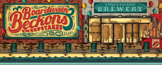
Established in 2007, the brand has always been known for its award-winning lagers, as well as its offbeat renderings of iconic imagery associated with facets of Coney Island. Since being sold to Boston Beer’s subsidiary Alchemy and Science in 2013, Coney Island Beer has dished out new exciting varieties (The Plunge, Hard Root Beer, and seasonal-unconventional, the hauntingly-complex Freaktoberfest). All beloved favorites celebrates the local community and the landmarked locale to the fullest in that each beer label art tells each beer variety’s story.
![]()
![]()
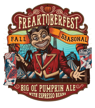
One Horse Town Illustration Studio expertly constructed and sanded down the fine points of the new artwork and packaging for the Coney Island Beer line. We love the vibrant illustrations because they are traditions in themselves, much like the local brewing of craft beer. The artwork embraces the spirit of Coney Island wholly; and each carefully finished label stands out as a testament to a colorful history—enduring, unforgettable.
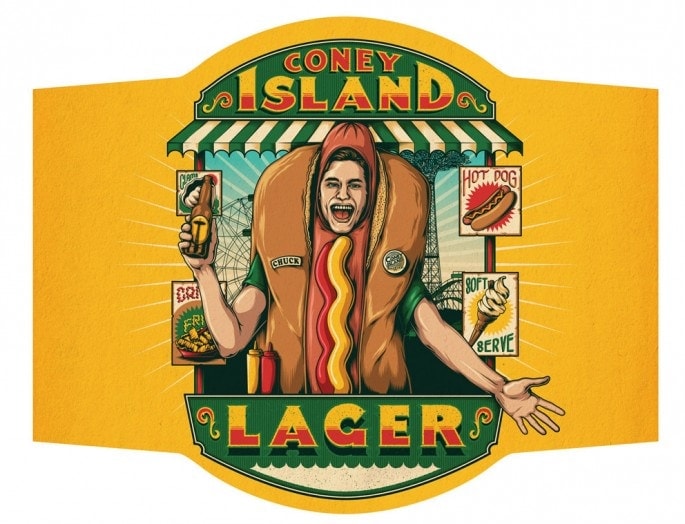
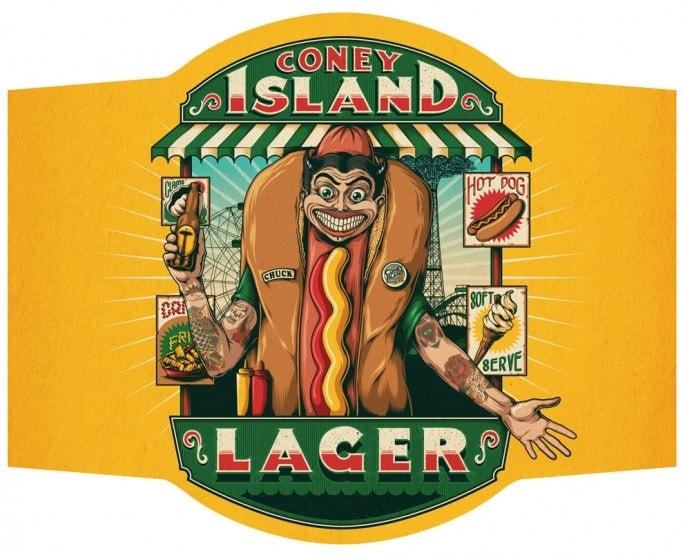
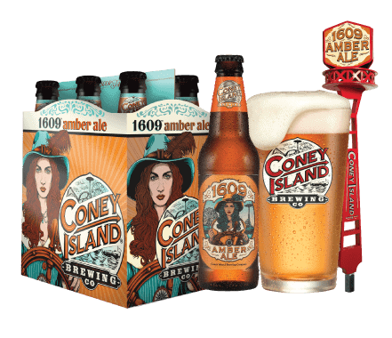
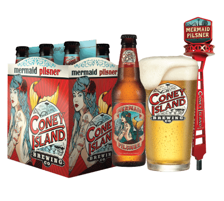
From the moment we looked upon the heavily tattooed and pierced Funny Face on the brand’s flagship, dry-hopped lager we seriously couldn’t get that label out of our heads. Light-bodied and crisp-drinking Mermaid Pilsner is the mildly-spiced bottled vitality of the nation’s largest art parade, the Mermaid Parade. The richly aromatic, deep golden Overpass IPA is a steadfast tribute to the artistic culture of the D.U.M.B.O. art district in Brooklyn. The bold, malt-forward, and slightly nutty 1609 Amber Ale toasts to the year the Dutch explorers first set foot on what now is NYC, consequently birthing this “The Playground of the World”. These labels quickly become pieces that stay with you to form a vivid recollection of everything Coney Island.

LABEL DESIGN TIPS:
- If your brand revolves around something as fundamental as arts and culture, leverage this by aggrandising your labels to match your celebrated inspiration/s. You don’t need to do this evenhandedly either—take creative license where and when you can. The important thing is to express your brand identity through your label artwork genuinely and ensure your customers are able to make that association right away.
- Labels are primarily to identify, but they are also creative platforms that are essentially your thumbprint to differentiate you from competition. A word of caution: make sure to align your packaging and label artwork with your brand identity to make sure these are consistent and represent your brand personality and values to a T.
- BONUS TIP!
“When designing a label remember that it is probably going to be competing among other similar products for the customer’s attention. Make sure it stands out on the shelf. Aim for striking colour combinations and artwork. Always bear in mind the size of the label when conceptualizing. It is always wonderful to have little details that the customer might notice when looking at the label up close but the key graphics and lettering should still be strong and clear enough to stand out on a shelf and be read from a short distance.”
– SIMON BERNDT, ONE HORSE TOWN ILLUSTRATION STUDIO
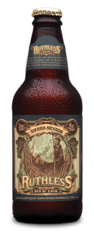
2. SIERRA NEVADA
Chico, California brewers of Celebration, Bigfoot, and other world-class beers.
Uncompromising in taste and pureness, quality-focused, highly inventive and innovative, and with a holistic perspective of process, craft, community, and environment, Sierra Nevada Brewing Company is a preeminent powerhouse that is a big inspiration to breweries and beer fans alike.
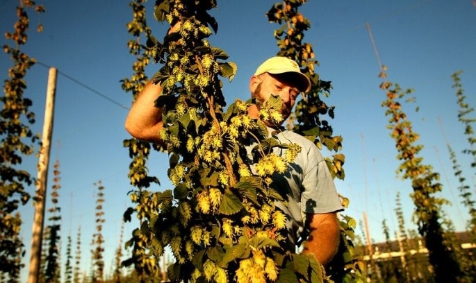
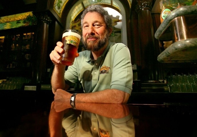
Ken Grossman, pioneer of this heritage brand, was always steadfast in the pursuit of his lifelong passion for the art of fermentation, starting in the 1970s and ever since stirring a revolution that would produce many firsts in the beer industry and help launch the American craft beer movement. From his humble beginnings in his homebrew supply store in Chico (simply named, “The Home Brew Shop”), month-long scavenging trips in rural dairy communities for stainless steel tanks that would later be transformed into hand-built brewing equipment, to successfully installing one of the nation’s largest private solar arrays to power their breweries, Sierra Nevada (named after Ken’s favorite hiking grounds in the nearby mountains) is an indispensable and constitutive limb of the brewing community, running on a passion that burns brighter than ever.
This tireless devotion to the art of crafting beer has led to many many trial-and-errors, many lessons learned. But most importantly this has led to prolific collaborative beer crafting projects with different people all over the world who share in the same passion. The result? An overture of delightful beers we are more than happy to savor.
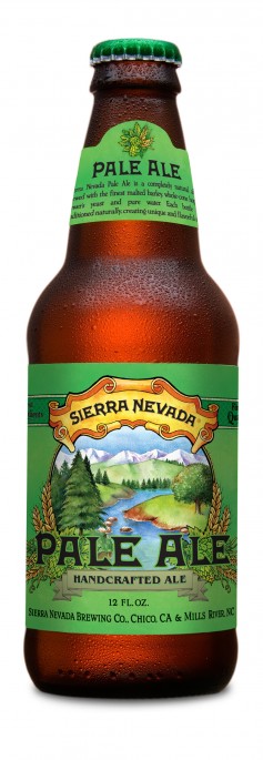
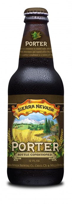
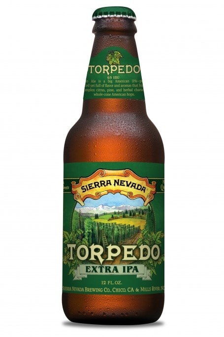
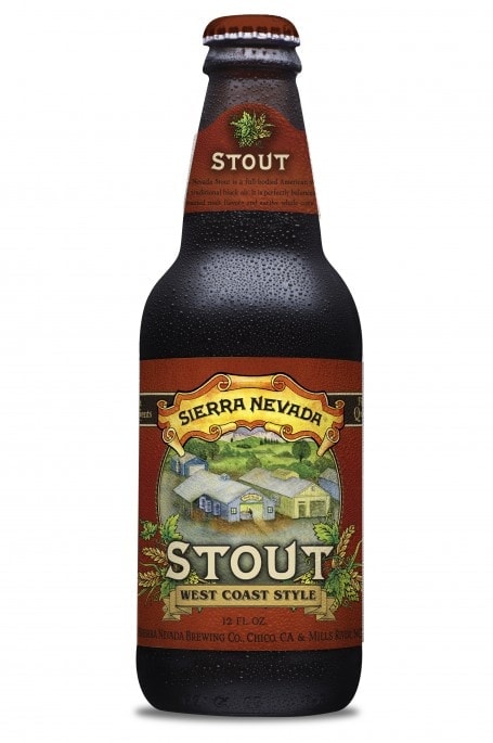
Design has been collaborative as well. Auston Design Group designed some of the Year-Round Beer label designs for Sierra Nevada, and Ken Taylor created the spotlight series of the seasonal and higher tier bottles (Ruthless Rye IPA, Narwhal, and Flipside), which we absolutely adore. The illustrative-style beer labels are audible references to the bold wilderness, picturesque landscapes, lush environs, and characters in the interesting stories about each variety’s origins. We think each label IDs each bottle with a thematic and consistent approach, tucked below the rustic scroll logo. Classic and timeless, indeed.
LABEL DESIGN TIPS:
- In this example, the artwork on the labels tell you outright what to expect with apparent context clues—the imagery, chosen color palette; and trademark names resonate either with seasonal use, potency, featured ingredient, where ingredients hail from, what event let to this or that beer variant’s creation. The result is the correct conditioning of both atmosphere and mood of the customer even before opening each bottle.
The key is to keep main elements constant (your logo, blurbs, general placement of art elements, and so on) while adding and removing others that will dictate your brand variant’s change in fragrance, flavor, or benefit. Especially useful for segregating brand extensions, creating your label artwork this way will add excitement and value to new product launches, while avoiding confusion that comes with a customer trying to identify an assortment of related products.
- If you’re a heritage brand, change may or may not be good—it all depends on insight from your team and, more importantly, your customers. Rebranding can hurt if this is done merely to “refresh” a brand’s image. Done without careful thought, changing your label artwork style can also attenuate that instant familiarity of your products. You’ll look shiny and new, but chances are you’ll also alienate your loyal customers. While you may be tempted to switch it up for the sake of improving your labels to reflect a better and newer brand image, think about your main motive for doing this.
3. JESTER KING BREWERY
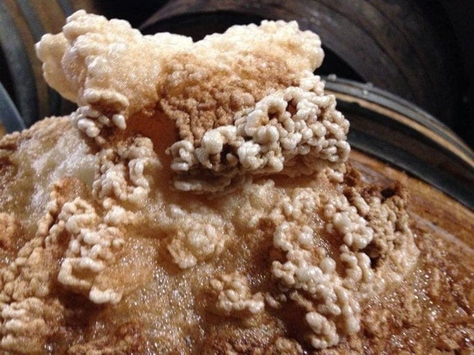
Nestled along the pleasant landscape of Texas Hill Country, the Jester King HQ is an authentic farmhouse brewery that has chosen to embrace a less structured and more instinctive style of brewing. Using farmhouse yeast, the company produces wild ales and spontaneously fermented beers, a process that emulates the beautiful and untamed purview of their locale. What this equates to is subscribing to a brewing method that involves considerably more time, patience, and a unique intimacy and understanding of fermentation and refermentation in serving vessels. Hard work, yes, but the fruits of their labor are arguably one of the more crafted and unique brews, possessing a different depth and elaborate flavor profiles enthusiasts would certainly recognise.
Founded by brothers Jeffrey and Michael Stuffings, Jester King Brewery has flourished as one of the more exciting and creative brewers of wild and farmhouse ales. Their process is as natural as it is compelling—they use water from their well, locally-grown and malted grains, with native wild yeast, to continually produce topnotch brews people patronise and, sadly, even try to hoard.
This rustic charm and inferred discipline in their craft sets them apart, and fans rave about their sour barrel-aged beers. Their unfiltered and unpasteurized sour beer is concocted in a minimum 6-month process; quality assurance means that customers only get what passes their standards, even if this means dumping a batch and starting over.
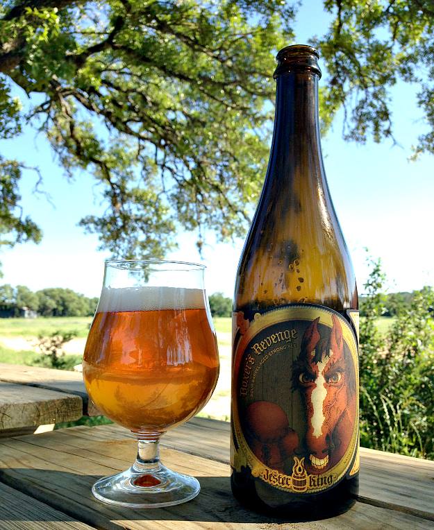

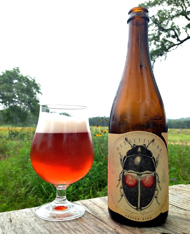
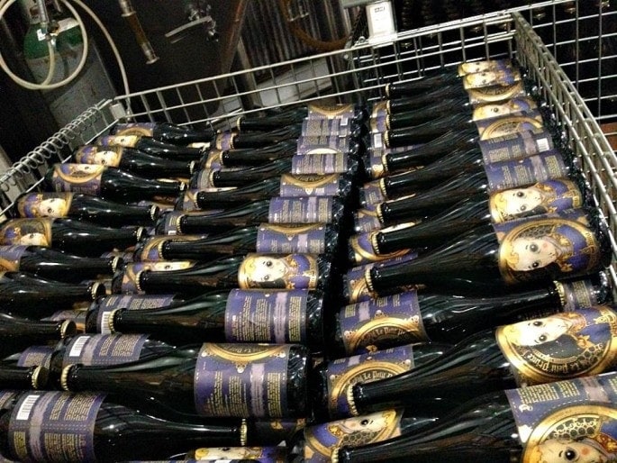
Jester King’s label artist, Josh Cockrell, is a freelance artist and also a dabbling homebrewer. He dreams up emotive and graceful artwork, but continues to do so not solely to personify the brand; rather he impressively creates characters that do not merely grace the labels—they are all at once graphic representations, statements, ideographs, dramatis personae that proffer relevant narratives that are meant to quicken realization, inspiration, or simply wonder.
We love the use of foil for their labels—tinsel is also one of our favourite go-to stocks to add depth and enhance a working design.
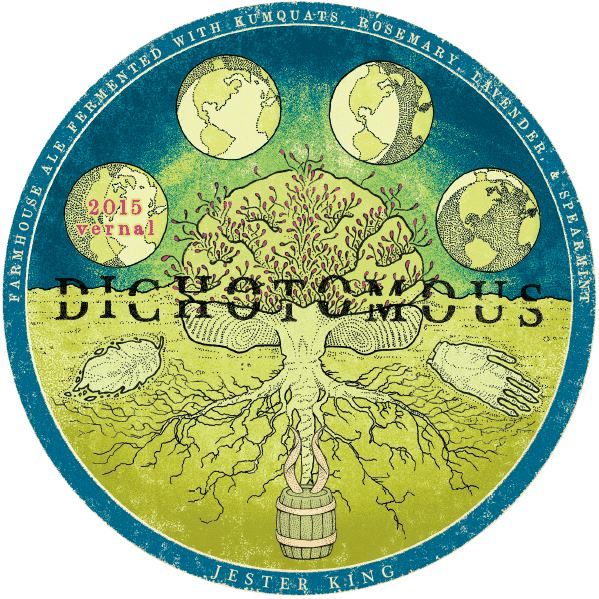
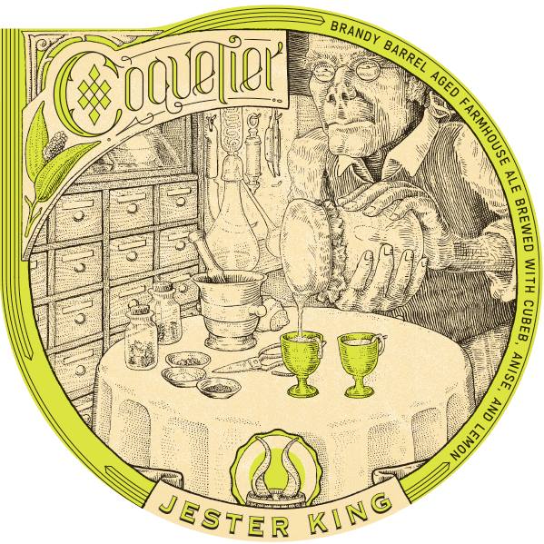
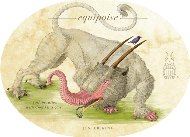
Photo credits: Logo and all images by Jester King Brewery.
LABEL DESIGN TIPS:
- When printing foil stock, it’s important to note that whatever you print on them will take the appearance of the foil substrate’s base color that you’ve chosen. To make sure colors are vivid and print exactly as you want them, remember to request for white ink underprinting on the areas where your print artwork will be.
- Successful labels are tools that tell your product’s story for you, even when you’re not there to elaborate. While some would opt to just do front panel merch, you can certainly use the whole wraparound space if you need more real estate for your concept. This way, you can opt to position a full art spread on the front, and transpose details and other text at the back, if this will distract from the message you’d like to convey on the front.
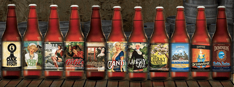
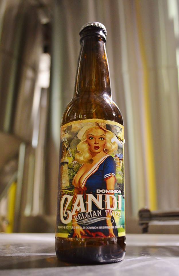
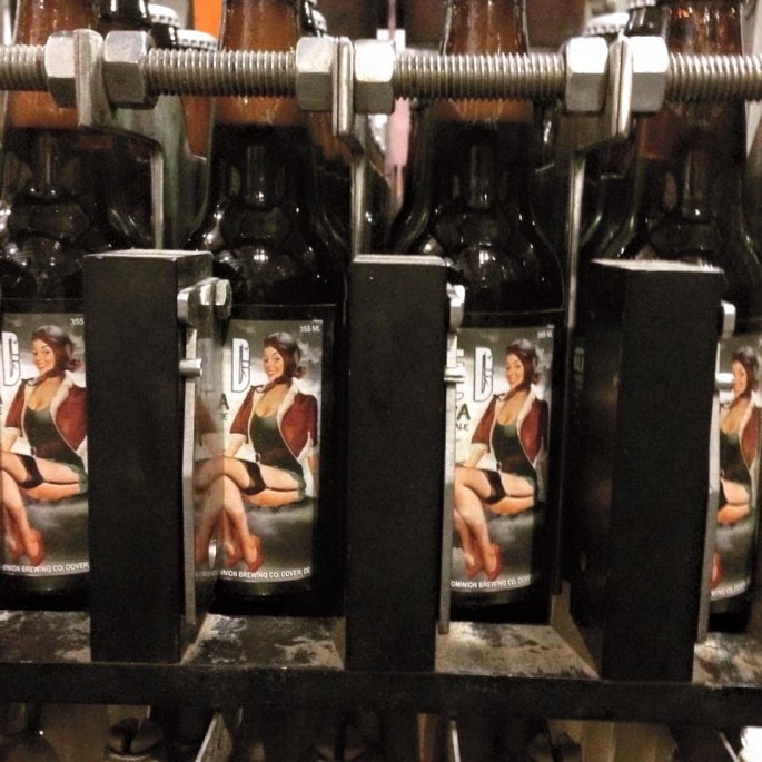
4. FORDHAM AND DOMINION BREWING COMPANY
BREWED IN DOVER, DE
![]()
This brand is an amalgamation of two breweries – sister companies Old Dominion, and Fordham. With a history of experimental brews and reverence for artfully-crafted ales, lagers, and sodas, these two companies (joining forces in 2007), are now known collectively as the Fordham and Dominion Brewing Company. The driving force behind this endeavour was to nurture a community where a palpable joy and wonder for craft beer was always to be shared and celebrated. Artisanal beers abound in good company, and a passion for rekindling the old tradition is truly galvanized.
Run by CEO Jim Lutz (previously from Flying Dog Brewery), the company enjoys orchestrating the introductory performance of ushering patrons into the world of craft beer. Handcrafting fine ales and lagers with unique flavor profiles, Fordham and Dominion Beers appeal to free thinkers looking for something more interesting.
Holding fast to their dedication to the craft, the company’s portfolio provides a myriad of varieties available in both kegs and bottles, their potent potables and gourmet soda perpetual local favorites. Some of the more distinct brews include the Double D Double IPA with sultry guava, mango, and tropical fruit aromas, and the Baltic Porter—a masterpiece that marries the flavors of toffee, liquorice, chocolate, with a touch of rye.
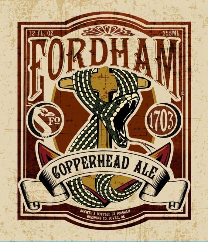
With a departure from their more traditional designs, the newer label artwork direction takes a conspicuous and straightforward theme. We love the decidedly poster-like layouts on the front panel. Featuring vintage pinup girl artwork, this double entendre infuses character and personality into these beers, meant to make them more engaging and easier to form associations with—this works hard for brand recall and engagement.
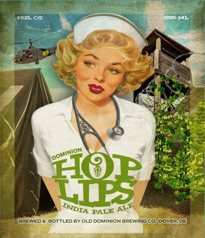
Photo credits: Logo and all images by Fordham and Dominion
LABEL DESIGN TIPS:
- As mentioned previously, it is important to have label artwork that is consistent across your portfolio. For cohesion, always remember that using colors can significantly help in standardizing the presentation of your products without needing to sacrifice individuality and the singularness of each product variant as grouped under, but separate, from your main brand. Shoppers recognise color easier than text, even from afar, so if you must choose between changing the font or changing a color bar to designate flavor or fragrance, choose color.
- Differentiating yourself from competition means offering an authentic experience—but this is not without “peacocking”. Brands with attitude will sell more than generic brands, because it pushes the product closer to the (target) customer, creating identifiable points between brand and customer. Don’t be afraid to inject humor or personality into your label artwork and packaging. As long as this stays true to who you are and what your brand personality and values are, customers will recognize this, and perhaps this might even start a conversation!
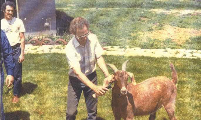
5. BOULDER BEER COMPANY
COLORADO’S FIRST CRAFT BREWERY – SINCE 1979
![]()
With over three decades in operations in the craft brewing industry, the Boulder Beer Company holds the prominence of being Colorado’s first microbrewery. After securing he 43rd US-issued brewing license, two college professors originally set out in their mission to produce bold beers in the traditional style of robust European ales, starting this in a small farm, with a brew house that shared space with goats in a shed! A modest start, but coupled with hard work and tenacity this paid off in furthering their vision. Consequently, the increasing popularity of their brew found them moving from the small farm, to the company’s current facility in Boulder. From a one-barrel production line, they now have impressively grown to a 50-barrel brewing system.
Breaking new ground with a creative team of brewers who actively design novel beer variants, Brewmaster David Zuckerman (with Gina Day and Diane Greenlee), since joining the company in 1990, has forged on with delicious archetypes of widely-heralded beers, having received over 40 awards and citations for excellence in both business and brewing. They also pride themselves in being PACE (Partners for a Cleaner Environment) certified, responsibly choosing eco-friendly options for energy resources, and distributing spent grain as feed supplements for local farmers to reuse every month. All the while, new styles of beer continuously delight customers, dextrously so with meticulously-developed and carefully-prepared brews.
Today, Boulder Beer Company produces some of the most flavourful beers, including Colorado favorites Buffalo Gold and Singletrack Rye Pale Ale, the dry-hopped session ale Hazed, and their award-winning brews: (the devilishly delicious) Shake Chocolate Porter and Emergent White IPA.
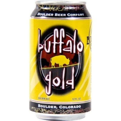
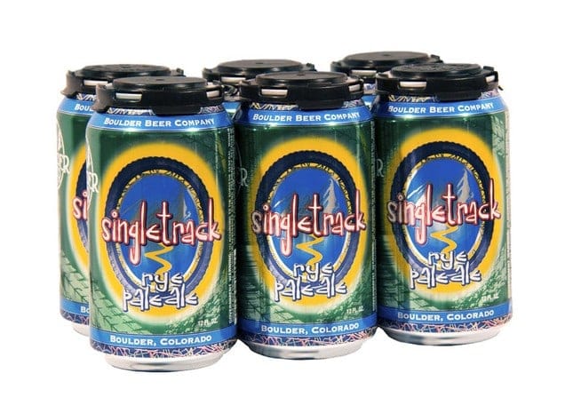
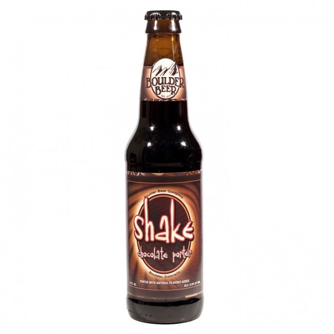
We love the label design because each variety has solid focal point, almost like an emblem, and with the consistent outer glow/stroke, this cleverly draws the eye in to focus on the name of the beer variant quickly. The art style itself moves more toward pop art and retro rather than vintage. Very cool. A big nod also to the vibrant gradients and patterns (that for some reason remind us of tie-dye) that set off the dark bottles nicely.
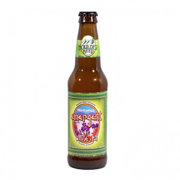
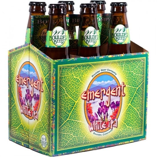
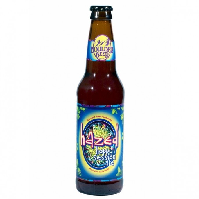
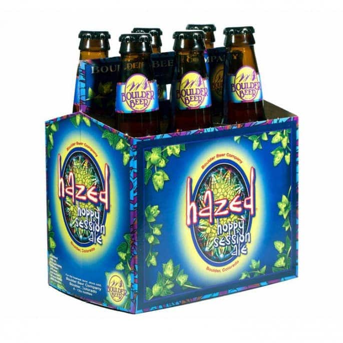
Photo credits: Logo and all images Boulder Beer Company
LABEL DESIGN TIPS
- Boulder Beer’s labels are great examples of the smart use of the die cut technology. Diecuts are cookie cutter molds that make it possible for you to get custom shapes and sizes, for seamless and faultless labels. In this example, it is used to “push out” the logo on the neck label, creating a bespoke look by maintaining the circular shape instead of opting for a plain strip.
- If your packaging requires a set of collaterals (a box and a flyer, or a paper tag and a brochure) think about the interaction of the designs once everything is assembled. Here, once packaged as a 6-pack, the neck labels are exposed, with the “body” of the product being concealed by the carrying case. Notice the smooth transition from label to case. This attention to detail helps tremendously to create a well-put together and professional look.
————————–
Labels carry the heart and soul of your brand, and we don’t take this huge responsibility lightly. We’re always excited to discuss branding and Prepress until we’re absolutely happy with the end result. We hope you enjoyed this post, and stay tuned for more awesome label designs!
*Just a note that we believe that branding isn’t everything: what makes your beer labels work in the long run is the dedication you put into your products and services, from defining your brand values, to your company culture, to speaking about things that you care about through your brand’s voice.
NEED ADVICE WITH YOUR OWN LABEL DESIGN?
WE’LL BE HAPPY TO HELP!